At TripExpert, we’ve built a database of nearly 600,000 professional reviews in over 500 destinations around the globe. In addition to aggregating reviews, we’ve also created a massive archive of over 1.2 million photos of hotels, restaurants, and tourist attractions, which together occupy about 275GB of space on Amazon S3.
After seeing so many wanderlust-inducing images, we’ve learned a few lessons about how to optimize your photographs and how potential guests interact with them. If you manage a hotel or restaurant or you’re photographing one, read on for our tips.
1. Hire a professional
It is easy to see the amount of energy spent on hotel photos by the quality of the images presented on your website. I don’t mean megapixels, I mean the amount of care that went into composing each of the photos you present of your property to your potential guests. Since this is the first impression your clients will have of your venue, it is worth bringing in a professional rather than taking a few snaps with your cell phone.
2. Get the rights right
When hiring a photographer, be sure you get the rights to use your images and to distribute them for use by third parties. Several hotels have sent me to the photographer, only to have the photographer ask for a fee to use the hotel’s photos. It is hard out there for artists and they’ve got to be compensated for their work, but a website promoting your venue shouldn’t be footing the bill. Pay your photographer enough for them to allow you to do what you want with the images later on.
3. Choose the best gallery
On your website, use an HTML-based gallery instead of a Flash gallery. Flash doesn’t work on iPhones and prevents your photos from being captured (except via screenshot). Make sure you choose a gallery that is responsive: it should work on web and mobile (and should support mobile touchscreen commands like swiping between photos). At TripExpert, we use FlexSlider.
4. Make it easy for others to get access
Although you may feel the desire to “lock down” your images to your own site, keep in mind that you’re trying to sell your property: it is in your best interests to make sure your images are easy to access. You don’t want a post about your hotel to go viral with a bad photo. If you chose to screen the outlets who receive your images, make sure it is easy for them to find a contact email address so they can reach out. Making images available to only a select few is a common practice with larger hotels. Be sure you make your press section as clear as possible with updated contact information.
If you’re unable to hire a photographer right now, here are some basic tips for photographing a room:
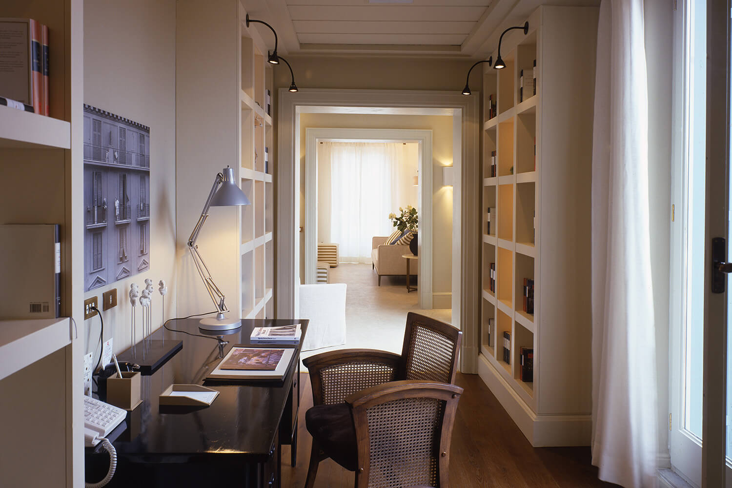
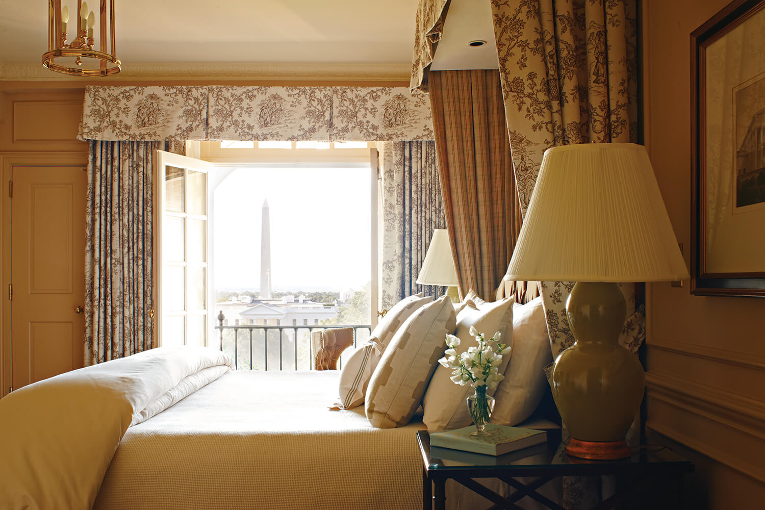
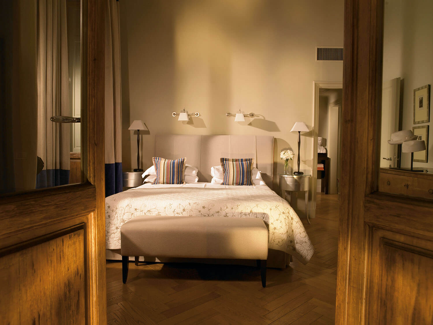
Rome’s Hotel de Russie using natural light and shooting straight & natural light on fleek at DC’s Hay-Adams
Use natural light
This will not only make the room appear sun filled and bright, but will avoid the issue of white balancing multiple lamps. Never heard of white balance? This is a good indication that you should hire a professional. Either way, Ken Rockwell has a great article about white balance and how to set it on your camera.
Long exposure is your friend
Another reason why a tripod will come in so handy is because of the length of your exposures. You will need to have a longer exposure to ensure your room is well lit and holding a camera still for 1/3rd of a second can be quite tricky. You can learn a bit about exposure from Cambridge in Colour.
Use a tripod
Seems silly, but it makes a world of difference when editing your photos. Slow down and look at the photos you’ve taken to make sure everything is in the right place. Compose them well in the camera so you don’t have to attempt any crazy Photoshopping afterwards. It is also nearly impossible to make a long exposure while hand-holding your camera.
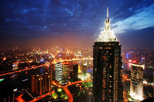
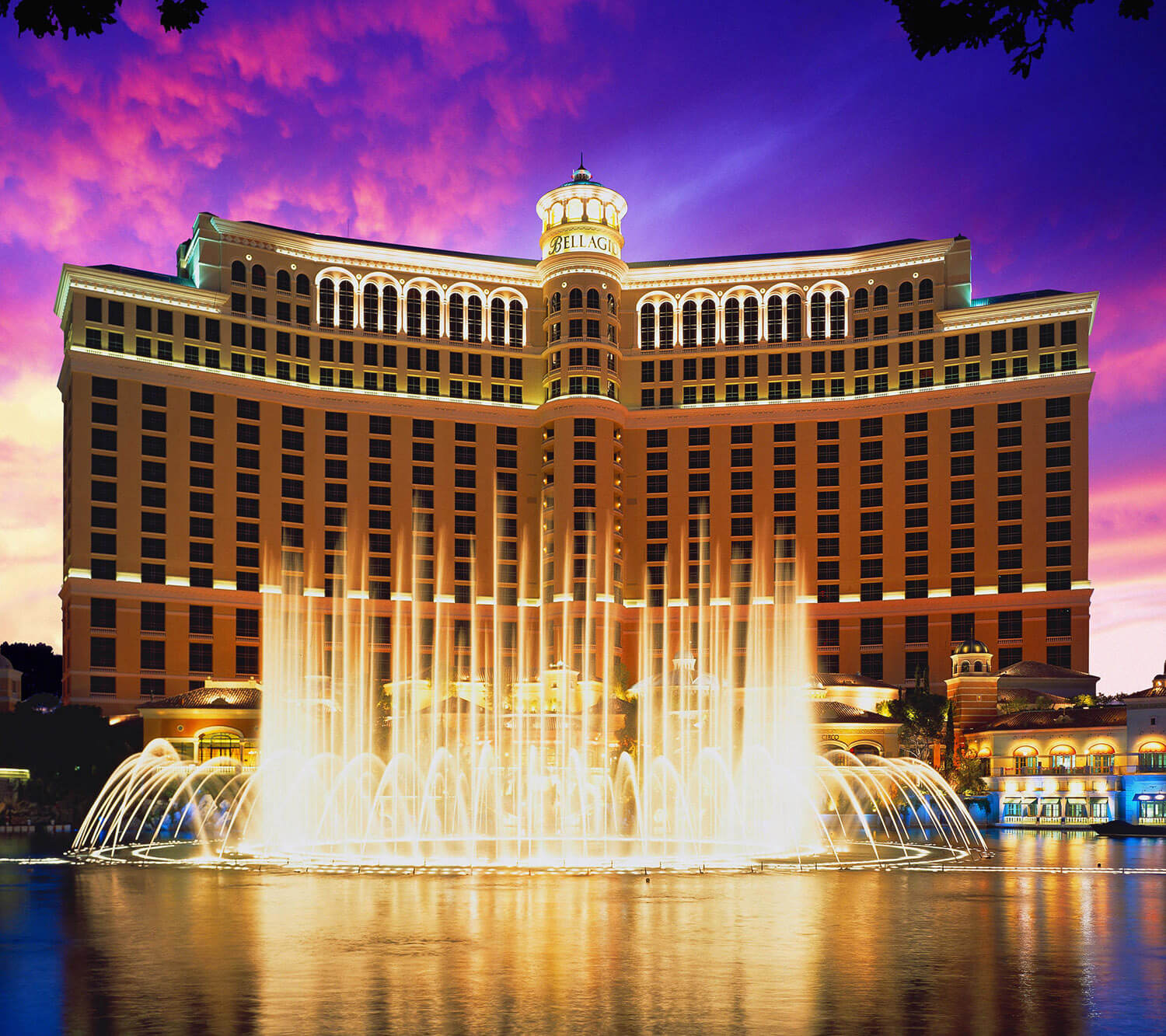
Pro tip: You’ve heard of the Golden Hour, but try photographing your venue just after the sun has set during the Blue Hour. You can capture the rich color of the sky and the benefits of a long exposure.
Don’t use fisheye lenses
I get it – you can see SO much more than with a regular lens, but it just isn’t worth it. Fisheyes distort the room too much and are too distracting. Do you want me to be daydreaming about how weird the walls look or how comfy your bed looks? In the event you have an underwater property and you are showing the room from the vantage of a fish, you may use a fisheye.
Don’t feature people
You want to show people the good times that your hotel has hosted and how luxurious a bubble bath looks, but showing people in your photos just makes me wonder how many people have slept in the room I’m about to stay in. There are few exceptions to showing folks in the guestrooms on your website.
This isn’t the time to get creative.
Photography is awesome. The challenge of photographing something and putting your own spin on it is one of the main attractions of the medium, but this isn’t the time to be the next Annie Leibovitz. Shoot straight, as DesignSpunge says. Also, keep your photos in color – it is hard to get the best idea of a room in sepia or black and white. Selective color never works out well, so try to avoid it.
Have some additional questions about photography? Want to chat about cameras? Drop me a line [email protected].
